
Citadel Contrast paints have been available for a couple of weeks now, and I dived right in by ordering nearly the entire range (save for Wyldwood and Gryph-Charger Grey) and doing a number of test runs with them. In this article I’ll be going over those test runs and explaining what I did and my thoughts on how it turned out. I’ll note colors used where I can recall them, but in some cases I won’t remember (flesh tones especially). The only colors that aren’t Contrast are base colors on the HeroQuest models. (No other models have had their bases done yet.)
The “TL;DR” of this is: I like Contrast paints, but they have specific uses. If you’r intending to only use Contrast in painting a model, you can get it to look solid, but don’t be expecting world-class from it. Maybe some super-experienced painters can pull that off, but most people won’t. They are great for getting through a lot of models in your painting queue, especially if you have a bunch of models lying around begging to be painted (as I do). For more advanced painting, they can serve as an initial coat, getting you a basecoat and shading in one go, helping you to see where to apply highlights. And you might be able to pull off some other fun tricks with them, but I haven’t experimented with those quite yet.
First test run: HeroQuest
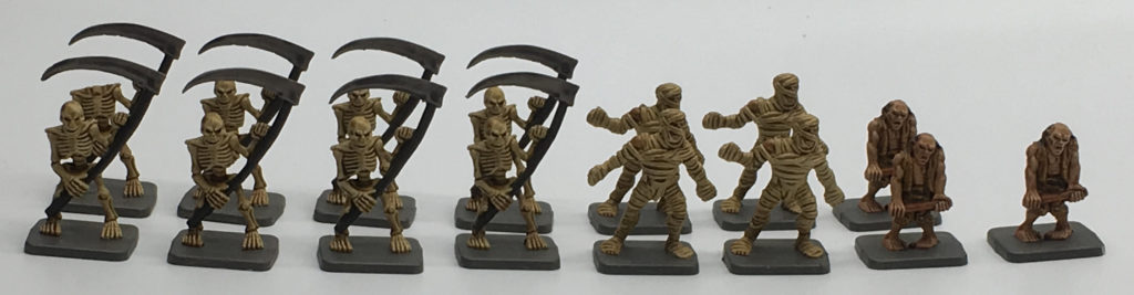
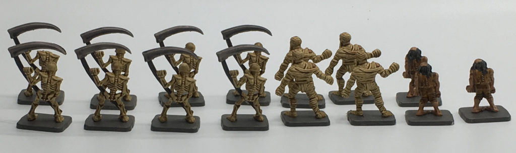
The first models I attempted were some old HeroQuest models I’ve had lying around. A couple of heroes that were sitting in my desk, and some Undead who were in a tackle box from their time as a stand-in Undead Blood Bowl team (which also explains why the zombies lost their weapons).
(Note: Please excuse the photo quality as I’ve gotten a new photo setup and am still getting the hang of it.)
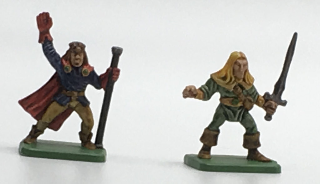
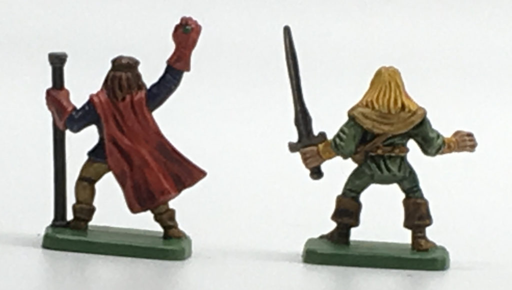
For the heroes, I used Snakebite Leather in appropriate places. The elf’s clothing is Militarum Green. Both also had some use of Aggaros Dunes. The wizard’s clothes are a combination of Talassar Blue and Blood Angels Red, a striking combination that’s rather rich in color. Metal bits were done with Basilicanum Grey, and wood and the wizard’s hair are done with Cygor Brown. The elf’s hair is Iyanden Yellow. Gold bits were done with Nazdreg Yellow, and a touch of Warp Lightning over it for some gems. Overall, not bad as the first two models I tested with, and I now feel good about pulling them out for use as NPCs in role-playing games. (It’s less the paint and model the model quality that means I wouldn’t use them for PCs.)
Skeletons were painted up with Skeleton Horde (of course!), Cygor Brown, and Basilicanum Grey. Mummies are Skeleton Horde with some flesh color (Fyreslayer Flesh, if I’m recalling correctly). Zombies were flesh, Snakebite Leather, Cygor Brown, and a bit of Black Templar for their hair. Nice and simple, but effective. These guys are definitely ready for use in some D&D, and would make nice enemies in HeroQuest… if I still had the boxed set.
These guys helped demonstrate that Contrast paints are really nice at getting board game miniatures painted up. Often such figures will just remain their base plastic color, but you can make your board games look nicer in short time with these paints.
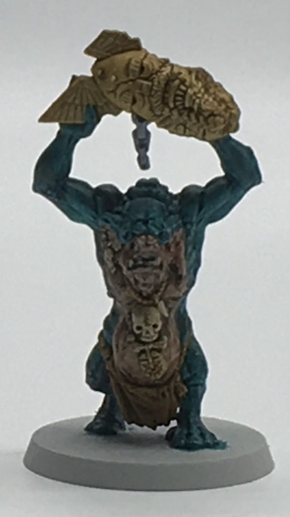
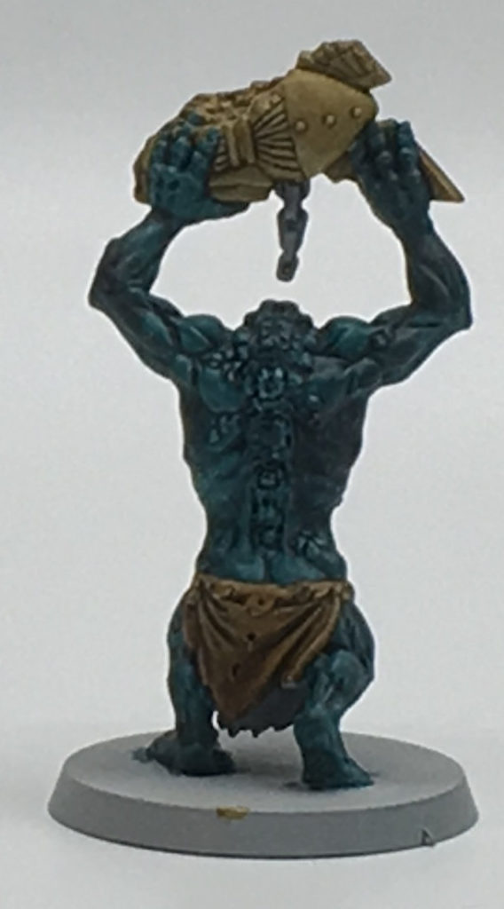
Going slightly larger: Minotaurs
I had a pair of old metal Minotaurs lying in a tackle box, assembled and never painted, ready for use in role-playing games where needed. So I figured they’d be a good test for going larger.
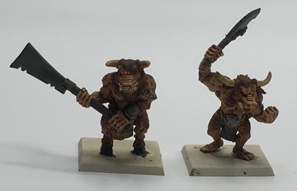
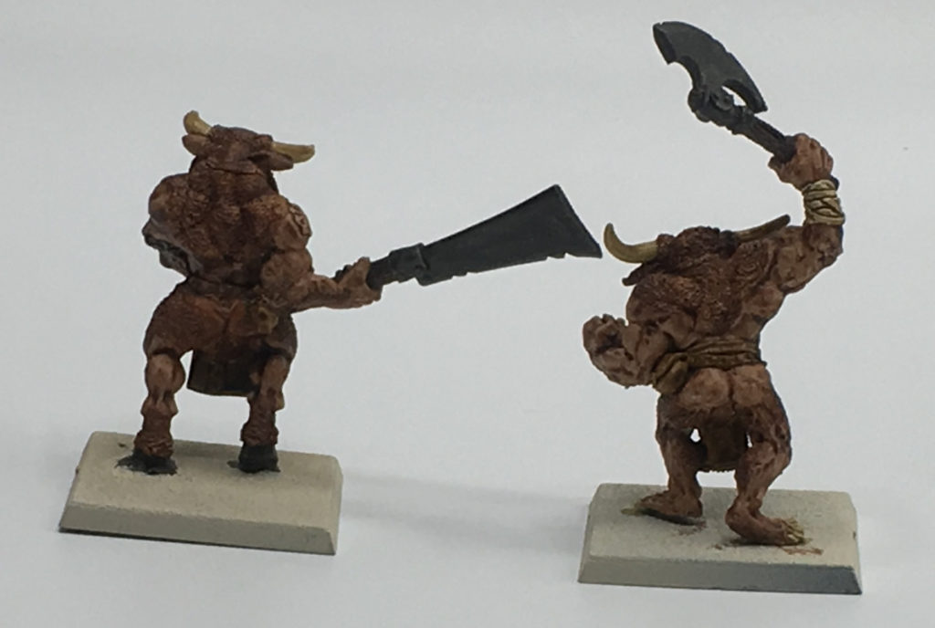
Colors used on these guys were Gore-Grunta Fur (fur), Basilicanum Grey (metal bits), Skeleton Horde (teeth, horns, nails, arm wrapping), Black Templar (weapons and hooves), Cygor Brown (wood), and, again, I don’t recall the exact skin color (I want to say Gulliman Flesh on these).
The paint did a solid job getting into all of the crevices and creating shading and basic highlighting across the models. They’re ready to hop onto the tabletop for an RPG session and look good enough to fight against detailed PC models.
Even Larger: Terrorgheist
Next, I wanted to try something even bigger. I’ve got a pair of Terrorgheist models who had an unimpressive half-finished paint job that I’d gotten as part of a bulk purchase of Undead, so I grabbed one, primed him Wraithbone, and set about painting him.
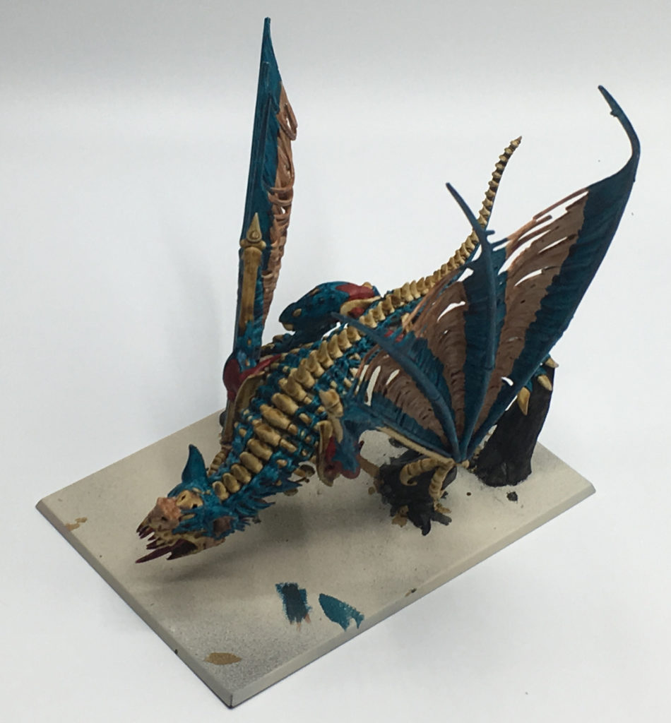
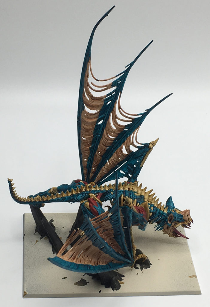
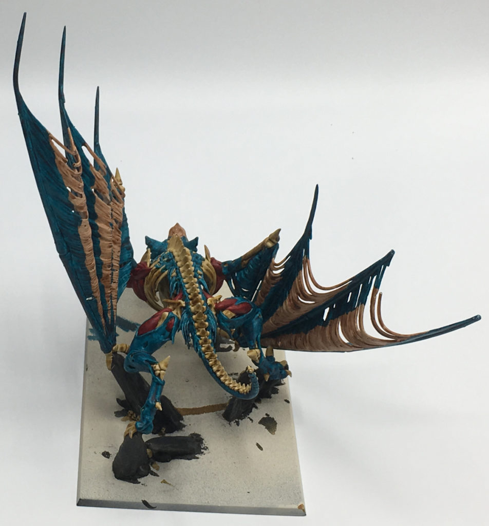
All I can say with the wings is, I wanted to try something different. I don’t really know what I was aiming for, but it’s an interesting look, and it works.
This guy is painted with Skeleton Bone, Akhelian Green, Flesh Tearer Red, Black Templar, Volupus Purple (for the tongue), Black Templar (just the stones), and flesh (I believe Fyreslayer).
One of the key lessons from painting this guy is that a large model like this should not be attached to a base at the time of painting, more so than usual. Trying to reach some of his innermost bits with paint was a real pain, and there’s areas that have no paint but won’t be seen unless you pick up the model and rotate it to look into his depths underneath. With Contrast being a thinner paint, it’s much too easy to get it to drip onto other areas, and that means painting up inside after painting other areas isn’t really feasible. If I was doing this again (and I quite possibly will with the other Terrorgheist on the shelf), I’d probably use Skeleton Bone with a large brush early in the process to get some paint up in there, so that even if an area isn’t the exact color I’d prefer, it has some color and you can “fake” it.
This model also taught the value of having pots of the primer colors on hand. It was way too easy for some color to get out of place and force an area to be touched up. One problem with Contrast paints is that applying colors in a corrective step like this can lead to an uneven look to an area, so with some colors (especially ones like Skeleton Horde), you might need to just go back to the basecoat color over an entire area (i.e. a whole bone, not just part of it) so that the end result when you reapply the Contrast color is even.
He’s not as impressive as the Terrorgheist I’d previously painted for my Undead, but once he’s based to match the rest of the army, I’d feel good about tossing this guy onto the table if I ever want to use a second Terrorgheist.
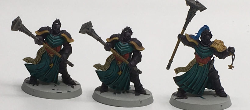
Testing for an army: Stormcast Eternals
After picking up the Age of Sigmar: Soul Wars boxed set last year, I’d assembled both armies, but they just sat on a shelf in the meantime. I’ve considered starting a Stormcast army to play around with, but wasn’t sure about what to do for painting them. Enter Contrast paints. I primed the lot with Grey Seer and set about on three test run models.
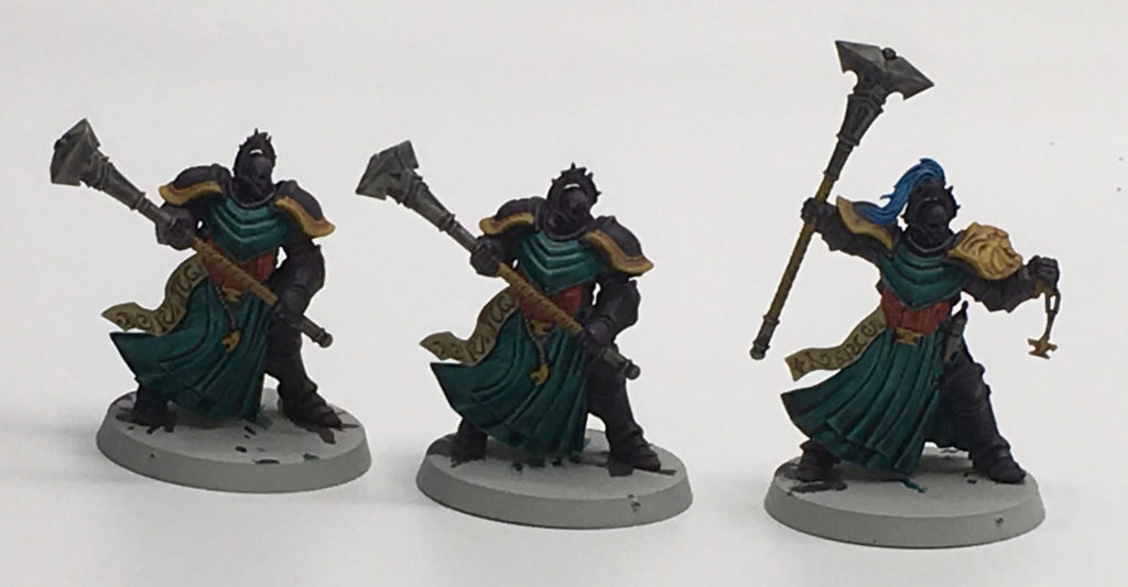
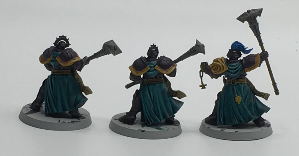
The paint scheme is influenced by “Hey, let’s see how this color works. And then this color.” Primary colors are Shyish Purple, Terradon Turquoise, and Blood Angels Red. Parchment is Skeleton Horde, trim and “gold” bits are Nazdreg Yellow, metal is Basilicanum Grey, weapon wraps are Aggaros Dunes. The helmet hair is Talassar Blue, which I also applied a small amount of inside the indented areas on their maces, giving a slight blue tint like a “glow.”
These guys turned out pretty solid. I think the Shyish Purple could possibly use some thinning (I need to pick up Contrast medium for that), as it’s very dark and heavily pigmented. My plan is to paint the army to this standard for now, which will look solid on the battlefield. In time, I can look to come back and apply some choice highlights, maybe try to play up that “magic glow” effect a bit. They don’t need much work beyond this to look rather nice, and considering I’m not excited when painting Stormcast, that’s good.
Painting a small army: Greenskins
When Age of Sigmar was announced, I excitedly threw together a bunch of spare Orc & Goblin models onto round bases to play it with the “proper” bases (I already have a full army of greenskins on square/rectangle bases). But they languished in the box and never saw the battlefield. So I decided to see what it’d be like to paint a small army with Contrast, how quickly I could do it and if the results would be solid.
Sadly to say, the army as it is won’t work until I add some models, as I need more Gobbos and Trolls. But the models involved are ten Orc Boyz, ten Orc Arrer Boyz, fifteen Night Goblin Archers, ten Black Orcs, a Troll, an Orc Shaman, a Night Goblin Shaman, and a Goblin Shaman. All of the units have full commands (champion, standard bearer, musician) except the Arrer Boyz.
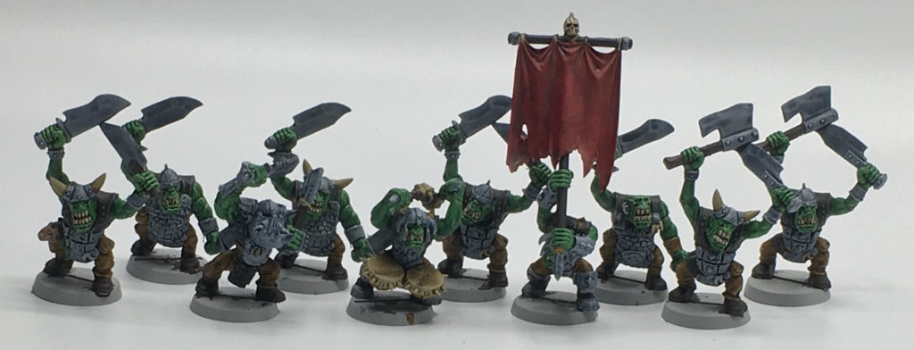
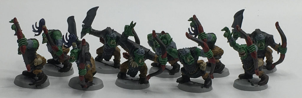
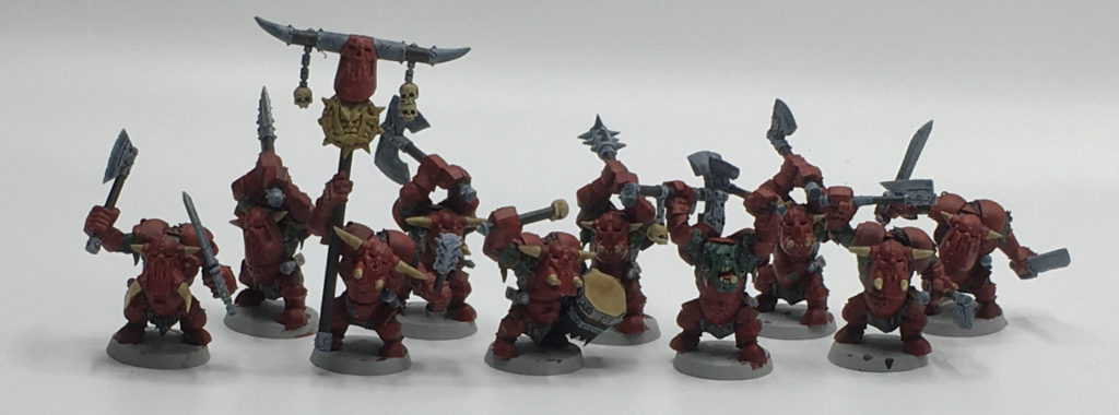
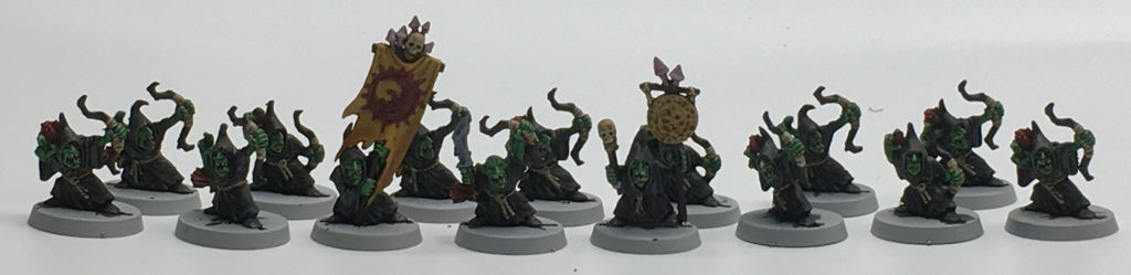
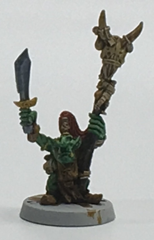
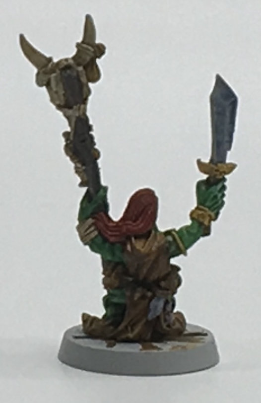
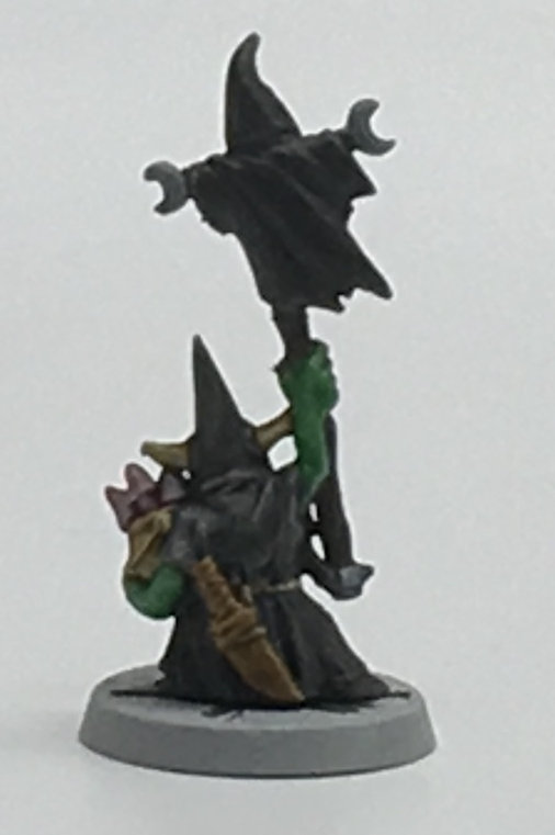
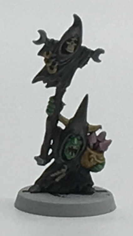
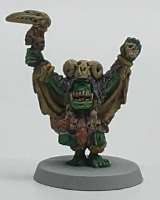
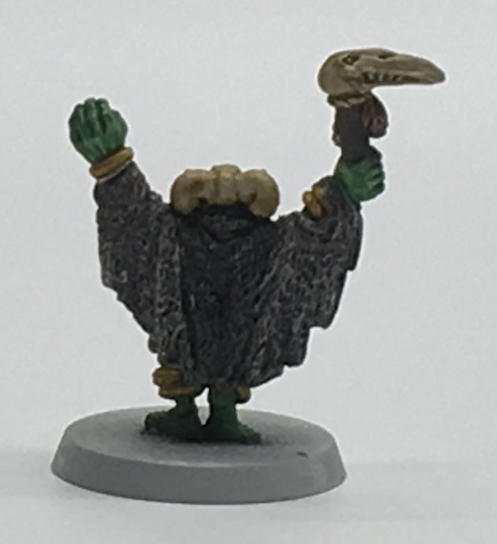
The army uses a core palette of Orc Flesh (of course), Black Templar, Snakebite Leather, Cygor Brown (wood), Flesh Tearers Red, Basilicanum Grey, and, to change things up, I tried out Space Wolves Grey for some of the metal (like weapons), which turned out kind of neat. Some Aggaros Dunes was used for some metal parts on command models to give some extra color. The Black Orcs used Dark Angels Green for their flesh, a nice dark green that works well for them. Mushrooms were painted with Magos Purple to give them a bit of color and help them stand out as fungus.
The Orc Shaman had a bit of extra work done to him. His wolf-skin cloak is Basilicanum Grey with some Black Templar in the middle, with Aggaros Dunes used for the “leather” side of it. He’s using Nazdreg Yellow for jewelry. The heads on his belt are done with Gulliman Flesh, and some Gryph-Hound Orange and Gore-Grunta Fur for hair. The heads on his weapon (or totem?) were painted with Gulliman Flesh first, then I decided to layer Basilicanum Grey over them, which makes them look like rather deceased and dried out heads.
The Troll was just a simple paint scheme of Terradon Turquoise, Gulliman Flesh, Skeleton Horde, Aggaros Dunes, and Basilicanum Grey. (Looking at him now, I’m remembering I forgot to repaint the chain on his right side. Easy fix.)
There’s some imperfections on some of the models, but that’s less on Contrast and more on me trying to see how quickly I could get them done while also being a bit under the weather. Trying to paint while feeling nauseous and unable to focus at times doesn’t do well. The Black Orcs especially have some bits of red in other places, but I was tempted to come back and splash some of it in places to represent blood anyway… which also made me thing the red armor is a handy color to have when bathed in the blood of your foes, because it won’t look “dirty,” and that’s Orc Logic 101.
Still, said imperfections aren’t that noticeable, and most of them are the kind of stuff you notice if you’re looking very closely to see if they’re high quality paint jobs. As an army, on the tabletop, they’ll look rather nice. While being sick wore on my patience some, I was rather happy with the end result, and the characters actually look pretty good. I need to find the extra models to flesh out the two units, and then I’ll find an excuse to use these guys in a game. In the meantime, more models for the PCs to fight in D&D!
Conclusion and Lessons Learned
This is a bit of a “conclusion in progress,” as I’m continuing to try out more with the Contrast paints and will likely write up further thoughts in the future. But for now, I have to say, I like them. I really like them.
Used carefully, they produce a solid tabletop quality miniature. I’d gladly use any of the models I’ve painted in games, and will.
But notice that phrase, “used carefully.” Yeah, there’s some caveats.
The common thing you hear with Contrast paints is “one thick coat.” That’s kind of true, but also not. You want enough paint to work properly, but you also don’t want so much on the brush you risk dripping it, and you don’t want to apply more to an area than you need, as it can run and get onto other areas.
Fixing mistakes with Contrast paints isn’t as easy as fixing mistakes with other paints. You can’t just slap a color over another color. Some colors will hide others, especially the heavier pigmented colors (like a Shyish Purple or even Flesh Tearers Red depending on what’s under it). But the colors are a bit translucent, to do what they do, so even Black Templars can show some paint under it. To fix a major error, you’ll need to paint on some basecoat color and then reapply the prior Contrast color. As I mentioned above, that can be problematic in some areas, as you might have a different tone than adjoining areas, or end up with some Contrast overlapping existing Contrast, doubling up the pigment to create a darker area in the “join.” Depending on the error, you might be better suited to just repaint a whole area.
You also want to keep an eye for “pooling.” The more paint you’re applying (and remember, you’re recommended to use “one thick coat”), the more you’ll see gathering in the recesses. You want some, yes, but not too much. You might also see some gather together on larger surfaces. Since it takes time for Contrast to dry, you can use your brush to touch the tip to these pools and “vacuum” some of it out. Gather some, dispose of it on a paper towel or elsewhere, then move on to the next pool. Carefully doing this can avoid some odd looking spots on a model (which, depending on the color, can also look chalky).
Contrast paints are obviously better with texture to work with. But when there’s texture, they work great. Just don’t expect them to work well on Space Marines. It’s possible to make them work by thinning them to flow smoother, but that’s an iffy proposition. Don’t even think about it with tanks. Detailed areas on a tank? Sure. The armor plates? Nope.
They aren’t a magical paint, but they’ll definitely help players get models to a tabletop quality in short time. I’ve worked through a solid batch in relatively short time, and have more projects line up and am excited to see what else can be done. (One of my next experiments is combining Contrast and some regular techniques.) This is kind of a big thing for me, as I’ve been iffy on painting lately due to the ravages of time, and have a backlog that was previously quite daunting.
For beginners, I’d recommend not trying to rush it. You need to be careful where your paint’s going and should keep an eye out for the pools. But on the plus side, that brush control you learn will be very helpful down the line!